Wait - Before telling you about creating the logo, I should explain why sometimes I use the term "Me" or "I" and sometimes I use the term "Us" or "We. Even though I'm the chief cook and bottle washer here at Pass It On Plates, and I'm pretty much "it" when it comes to producing plates and PlateWraps and things in the Oregon studio, I've got a crew helping to develop this business in our Wisconsin studio. The reference to "We" and "Us" includes the whole group of talent at Pass It On Plates.
The head of our Wisconsin studio is my smart and clever mother, Donna. Yes, this is a mother-daugher project, 1,763 miles wide. She not only creates plates and works with making PlateWraps and Pretty Little Doo Dads, but she works tirelessly on our marketing, sells plates at local art shows and at the Hayward Flea Market, and works with local business development experts to put Pass It On Plates on the map, so to speak. Donna also found some local talent to help make PlateWraps and help out with other related creativity.
Back to the logo:
Our first step was to decide on a logo to use. Since this logo would be plastered on everything sent out of our studios, it had to be simple, easy to recognize (not some obscure shape or random photograph,) easy to put on our plates - which means it has to be easy to draw by hand, and unique. We did a little brainstorming and Donna came up with this:

Logos 1, originally uploaded by passitonplates.
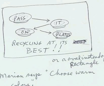
Sketches from the first brainstorming session to figure out a logo for Pass It On Plates.

Logos 2, originally uploaded by passitonplates.
More logo sketches. The idea is starting to come together. Donna got several friends involved to see if they could figure it out.
Logos 3, originally uploaded by passitonplates.
Still playing with the concept of the plates and working out some kind of visual graphic for a logo. Even if they don't fit our criteria to be simple and easy to duplicate by hand, it was important to sketch out every single idea. You never know which idea will lead you to the one that ultimately gets used.

PIOP+Logo1, originally uploaded by passitonplates.
Here is the very first incarnation of our Flying Plate logo.
From here we tweaked it and made minor adjustments. We showed it to friends and business developers and asked for their opinion, then we made a few more adjustments. In the end, our logo developed into this:

No comments:
Post a Comment
Thank you - I appreciate all comments, questions, praise, criticism, suggestions, requests, reports ...